WEB DESIGN

COLORS SPEAK LOUDER THAN WORDS

Bottomline
Discover how colors can shape user experience and brand
perception in the digital world.
Circle

THE PSYCHOLOGY
OF COLORS

Bottomline
Brief overview of color psychology.
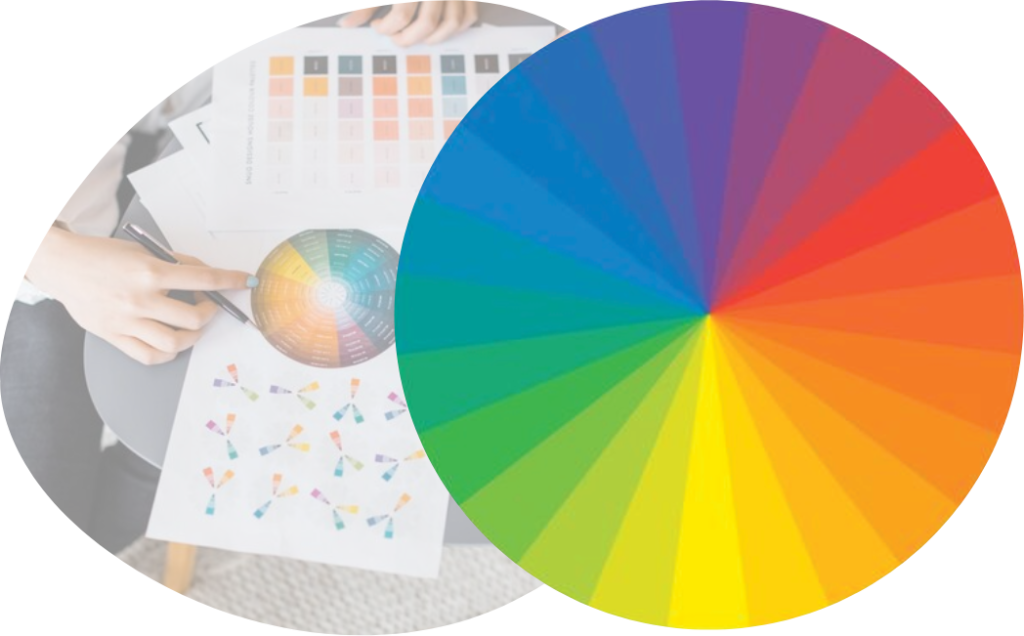
Color psychology is an artful study that masterfully connects colors with human emotions, playing a crucial role in sophisticated marketing and design strategies.

It’s about selecting hues that not only captivate the eye but also resonate deeply with an astute audience. Consider how rich blues convey trust and stability, while warm reds exude energy and passion.

This nuanced understanding of color psychology is vital for business owners seeking to elevate their brand presence and create an environment that appeals to a discerning clientele. It’s a harmonious blend of visual appeal and refined sophistication, designed to align with the elevated tastes and expectations of savvy consumers and business professionals.

COLOR MEANINGS
& ASSOCIATIONS

Bottomline

Decoding Color Meanings

Colorful Mind
Red

RED

Energy, Passion, Danger, Urgency (Great for CTAs)

Green

GREEN

Growth, Health, Wealth (Used in Finance and Wellness Sites)

Orange

ORANGE

Creativity, Enthusiasm, Fun (Good for Call-to-Actions)

Black

BLACK

Elegance, Sophistication, Power (Used in Luxury & Minimalist Designs)

Blue

BLUE

Trust, Calmness, Professionalism (Popular in Corporate Sites)

Yellow

YELLOW

Optimism, Caution, Happiness (Can be Overstimulating if Overused)

Purpole

PURPLE

Luxury, Mystery, Spirituality (Often Used in Premium Brands)

Gray

WHITE

Purity, Simplicity, Cleanliness (Creates Space and Breathability)
 

Leftimg

COLOR IN BRANDING

Bottomline
Branding with Colors
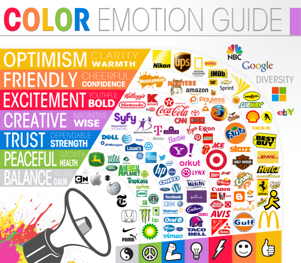
Colors are a fundamental part of a brand’s visual identity. They convey the brand’s personality and values. For example, McDonald’s iconic use of red and yellow is a key part of its brand identity.
These colors are instantly recognizable and have become synonymous with the brand. The red is bold and energetic, reflecting the fast service and dynamic environment, while the yellow is warm and inviting, symbolizing the friendly, welcoming nature of the brand.

USING COLOR IN
WEB DESIGN

Bottomline
Strategic Color Placement
In web design, effective color use is key. Best practices include choosing a balanced color scheme that reflects the brand, using contrast to boost readability and highlight key elements, and ensuring consistency across the site for a cohesive experience.
Prioritizing accessibility, like sufficient color contrast for visual clarity, and understanding the emotional impact of colors are also crucial. Incorporating white space helps in maintaining focus and enhances overall design appeal.
Screen
Manwork

COLOR AND USER
EXPERIENCE (UX)

Bottomline
Colors That Click: Enhancing UX with Hues
At Orange Web Group, we understand the power of color in enhancing user experience (UX). Our ‘Colors That Click’ philosophy is centered around leveraging hues to not only captivate but also to guide and ease user interactions on your website.
We strategically select colors to highlight essential elements like calls-to-action, ensuring they stand out and prompt user engagement. Our focus on color contrast is not just about aesthetics; it’s about making your site accessible and easy to navigate for everyone. This thoughtful approach to color usage is key in creating a seamless and intuitive digital experience, driving user engagement and conversions, essential for the success of your online presence.

CONCLUSION

Bottomline
Painting the Digital Landscape
In the world of web design, colors are not just decorative elements, they are powerful
tools of communication. Let Orange Web Group help you choose the right palette for
your digital presence.

WANT TO COLOR
YOUR WEBSITE
WITH SUCCESS?

Bottomline

CONTACT US TODAY!

Ef7f5ee199640e800d6cc185237db32f?s=300&d=wavatar&r=g
Orange Web Group
Orange Web Group, LLC
Best Web designers in Orange
Top Orange Web Developers
Best Web designers in Orange