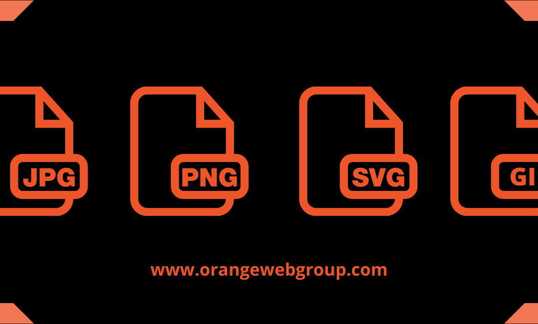
JPGs, PNGs, and GIFs!
Choosing the correct Website Image file format is crucial since the pictures on your site have a significant impact on the online experience of your visitors.
We’re visual creatures by nature, and we’re motivated by our senses. Because we process visuals quicker than words, images are scanned first, followed by text.
Because images are extremely informational, emotionally engaging, and instinctively express messages, brand, and aesthetics, they are frequently utilized to supplement the text content on a web page.
Only 7.3 percent of websites utilize no visual material at all, which is unsurprising. If websites wish to inform, encourage, connect with, and sell to their viewers, they need good pictures.
Many website owners, however, are still unsure of which picture file type to use or how to optimize it. What’s the ultimate result? Because it’s not the greatest format available or designed for the web, you mistakenly export low-quality graphics, which slows down your page performance. Yikes!
It’s critical that you choose the right Website Image format.
Each picture type, like logo file types, serves a unique function and has its own set of advantages and disadvantages. Understanding the fundamentals will give you the confidence to choose the right structure for any given circumstance.
In order to deliver the greatest possible user experience to your website visitors, this post discusses why the image formats you choose are important, the major distinctions, file formats, and when to use each format.
Why are Image file formats important?
All graphics on the internet are image files. These files come in a variety of formats, and while you can usually convert one to another, this isn’t always a smart idea. They have various file sizes and render the same photos in different ways.
Each file has a distinct purpose and is important in terms of aesthetics, speed, and scalability.
Appearance: Some picture formats have more detail and are higher-quality than others.
Performance: Some picture files take up more space than others, affecting the time it takes for your website to load.
Scalability: While certain picture formats can be scaled (enlarged or shrunk) without losing quality, others cannot. This can have an impact on how things seem on different screen sizes.
Your website’s files should result in short file size and a fast-loading image (performance) without sacrificing quality (appearance/scalability).
What are the different types of Image files?

Raster files and vector files are the two primary types of image formats. Each category has a specific purpose.
Lines, points, and polygons are used to represent a picture in vector graphics. They’re ideal for simple geometric designs and make excellent logos and icons.
Because vectors can be stretched indefinitely without losing quality, they’re perfect for high-resolution displays of various sizes. Vectors, on the other hand, are not the ideal file format for storing photographs.
Formats for vector files include:
- SVG
- AI
- EPS
To depict a picture, raster graphics use pixel values within a rectangular grid. They’re great for photos with a lot of detail, like photographs.
These file formats, unlike vectors, are resolution-dependent and size-based, which means they can’t be scaled up without losing quality and becoming pixelated. The vast majority of Website Images on the internet are raster images.
Formats for raster files include:
- JPEG
- PNG
- GIF
- PSD
- TIFF
CMYK and RGB image color modes
CMYK and RGB are the two main color options that may be used to store images.

What’s the distinction? It depends on where and how the image is shown if one mode is always better than the other.
The color space for printing is CMYK (Cyan, Magenta, Yellow, and Key/Black). These shades reflect the four inks that will be mixed together during the printing process. This option optimizes image files for printing.
The best color space for the web is RGB (Red, Green, and Blue). These light colors mix to create new shades. Image files saved in this mode are web-optimized.
If you need to, you can convert between RGB and CMYK. To have more color control over the Website Images, familiarize yourself with the various color modes.
Dimensions and Resolution of the Image
The amount of detail in an image is referred to as resolution. Display resolution is measured in PPI (pixels per inch), whereas printer resolution is measured in DPI (dots per inch).
Higher resolutions indicate there are more pixels/dots per inch, which means there is more pixel information and a higher-quality, sharp image.
In truth, screen pictures are not the same as print ones. Why? Because we must consider the monitor’s pixel measurements rather than the size of the project to be printed.
Each monitor has a distinct screen resolution, and display quality is continually increasing thanks to new technology (Apple’s Retina display), making it tough to create a website with graphics that look great on all devices.
For a good-quality image at a practical size, you’ll need at least 300 DPI for printed photographs. The print quality of a picture is affected by DPI and PPI, but not the online display quality.
A frequent fallacy is that photos must be adjusted for screen display at 72 PPI and that the PPI value is the determining factor of image quality for online images, but in reality, pixel dimensions are the decisive element.
The physical size of a picture relates to its printed dimensions (for example, 5″ × 7″) or the pixel measurements displayed on the web (ex: 500 pixels x 700 pixels).
The memory size of an image file is affected by its resolution and pixel dimensions: how much space it takes up on a hard drive or in your web browser.
Capture your photographs at a high quality and size when taking photos or scanning since it’s easier to lower the size of an image (discard pixel information) than it is to increase it (create pixel information).
Optimize your photos by using uniform pixel measurements for improved speed and online presentation. Upload your photographs in a size that’s close to the one you’d want to see.
If you use Squarespace for your website, I recommend reading their instruction on online image formatting (along with their other support manuals).
Lossy and lossless.
There are two types of raster files: lossy and lossless.
Lossless compression is used for image improvement. When storing an image in a lossy format, data is removed and the image is compressed to a lower size. This may result in a reduction in image resolution, but it’s great for online use where file size and download speed are critical.
Lossless picture formats capture all of the data in the original file—no information is lost, and the resolution remains unchanged. In addition to your optimized website photographs, always start with your original photo in a lossless format and maintain a copy of it.
Image Metadata, often known as EXIF Data
The kind of file, size, dimensions, device model, camera settings, GPS coordinates, date and time, a picture thumbnail, descriptions, and copyright information are all stored in the file.
This is the EXIF format (Exchangeable image file format).
To view EXIF data on your computer, go to:
- For Mac: in the Finder, choose your image, then hit command I OR control and click, then select Quick Look.
- On a PC, highlight your image, right-click, choose properties, and then choose details.
When should each file format be used?

The ideal picture file format to use is determined by the type of image and the intended purpose. JPG files should be used for photos, while PNG or SVG files should be used for logos and basic graphics.
Keep in mind that the lesser-known WebP format may provide the same quality and file size as JPGs and PNGs.
Low(er) resolution, lossy picture formats are appropriate for situations when file size and loading speed are more critical than image quality. However, you can optimize a picture for the web without sacrificing too much quality, which is precisely what you want!
Aim for the highest picture quality and pixel size for the image’s intended display without compromising web page performance or overall site load time. What’s the ultimate result? A superlight website that reads well on any device while still looking great. Yay!
Optimizing photographs for your site isn’t always simple (I’m not speaking from experience here) and will almost certainly require some trial and error. However, after you’ve mastered image optimization, your website’s performance will improve.
If you have photos on your website, run an image speed test to discover which ones should be improved. The good thing is that you can always upgrade your website and refresh it with a larger graphic.
JPEG, PNG, WebP, SVG, and GIF are some of the most commonly used image formats on the internet.
Because not all image formats, such as TIFF or BMP files, have broad browser support, I’ll focus on the picture file types that are commonly supported by web browsers. For your site’s pictures, you’ll want to choose the most appropriate format.
JPEG is an acronym for Joint Photographic Experts Group.
A JPG file is a raster-based picture intended for usage on the web and in print. Because of its compression and universal compatibility, the JPG format is the most prevalent picture format used on the web.
These files are ideal for storing images with tiny file sizes and minimal quality degradation. JPGs employ lossy compression, which means that the quality of the image degrades with each saving.
JPGs must be saved in the appropriate size and resolution for their intended use. Specific picture sizes are used by social media platforms to restrict resolution, eliminate pixelation and image stretching, and guarantee that the entire photo is seen.
Pros:
- Support for all web browsers
- File and email attachment sizes are small, and loading times are quick.
- Allows for the display of millions of colors
- Images that are sharp and of excellent quality
Cons:
- Transparent backgrounds are not supported.
- Picture compression that is lossy results in poor image quality or text readability.
- Computer-generated visuals are not permitted.
PNG is an acronym for Portable Network Graphic
For online use, a PNG file is standard. These files are pixel-based, and scaling them up will result in pixelation. This implies that, like JPGs, they must be exported at a suitable size for the intended use.
Due to lossless compression (you may save a PNG without losing any quality), a PNG file offers translucent backgrounds and retains generally higher quality pictures than JPGs for graphics (not photography).
PNGs are considerably better for visuals with fewer colors and quick color transitions that need to stay crisp, such as logos, icons, and basic drawings.
PNGs provide a clearer, more defined picture on digital and mobile devices, so utilize them on your website and social media. Make your PNG files as little as possible while preserving high quality for the web.
Because it preserves a picture with more colors, PNG-24 produces a clearer image than PNG-8, but the file size might be substantially greater. If your website’s CMS doesn’t support SVG file uploads, a high-quality PNG file will suffice.
Pros:
- Support for all web browsers
- Supports transparency
- When it comes to graphical aspects, this is the best option.
- Compression without loss
- Small file size with limited colors
Cons:
- Millions of colors in a large file
- Not suitable printing–optimized for the screen
WebP
WebP is an online picture format created by Google in 2010 with the goal of providing superior lossless and lossy compression.
Web compression is better in next-generation image formats like JPEG 2000 and WebP than in PNG or JPEG. Switching from JPEG and PNG to WebP can help conserve server space since the picture compression maintains the original image’s clarity while drastically reducing the file size. As a result, there will be reduced data use and quicker downloads.
Unfortunately, most CMS platforms do not support WebP format, and uploading these files typically necessitates the use of a plugin extension or workaround, which is why we have yet to optimize our site’s photos using this file format.
Pros:
- Smaller file size for the same image quality
- Lossy and lossless compression are both used.
- Supports transparency
Cons:
- All CMS platforms, including Squarespace, do not support it.
- Not supported by all browsers, specifically Safari and Internet Explorer
SVG is an acronym for Scalable Vector Graphics
The World Wide Web Consortium (W3C) created SVG, an extensible markup language (XML) vector-based picture for representing two-dimensional visuals.
An SVG file does not employ a pixel format, allowing the picture to scale while maintaining a high level of quality. These files may be opened in image editors and web browsers and have translucent backgrounds.
When compared to PNG and JPG, an SVG file is the best format for logos, icons, and simple illustrations since it provides the highest quality graphic (in that order).
Pros:
- Support for all web browsers
- The file size is little.
- Basic shapes and text may be scaled without loss.
- Supported by illustration software
Cons:
- For photos or complicated drawings, this is not the best format.
- Not supported by all CMS platforms, but there are workarounds
- Some default image editors do not support it.
GIF is an acronym for Graphics Interchange Format
All major online browsers and most image editors support GIF as the sole animated picture format. Transparency and animation are supported through GIFs, which may also be extensively compressed to minimize file size.
GIF is a lossless raster format that works well for animated visuals with few colors. Because GIFs only support 256 colors, they aren’t suitable for storing images.
APNG (Animated Portable Network Graphics), WebP, MNG (Multiple-image Network Graphics), and FLIF are some more animated picture file formats (Free Lossless Image Format). However, these are not universally supported.
GIFs may be made with image editing software such as Adobe Photoshop, GIMP, Microsoft GIF Animator, Giphy, and Gyfcat.
Pros:
- Animation support: used for small animations and low-resolution video clips
- Support for all web browsers
- The file size is little.
Cons:
- Photographic quality reduction
- Limited colors due to 8-bit (PNG and JPG supports 24-bit)
- Issues with copyright
Important Points to Remember
Understanding the different file types and their intended uses will help you enhance the quality and performance of your Images when it comes to picking the proper image file format for your website.
However, selecting the appropriate Website Images file format is simply the first step. After you’ve got the file format down, make sure your photographs are optimized for accessibility with the correct pixel dimension, ideal file size, SEO keywords (search engine optimization), and alt text.
Please let us know if you found this post useful or if you have any queries in the comments section. I’m also curious about the Website Images file formats you use. JPG, PNG, and SVG are the most often used formats at Orange Web Group.
Do you require assistance with your small business’s brand and website? We’d be delighted to speak with you. Orange Web Group is a full-service digital agency specializing in website design and Website Maintenance in Los Angeles, CA.
Save money and time by avoiding hassles. Hire a team of Website Maintenance in Los Angeles today. Please fill out our contact form and we will set up a meeting time or call us at 714.919.93.


